
A mobile-friendly website is not just one that “shrinks to fit” on a phone. It’s a site that loads fast, is easy to use with thumbs, and converts visitors on any device. This guide shows non-technical site owners how to audit, prioritize, and implement a mobile-friendly strategy that improves both user experience and business results.
Table of Contents
Key Takeaways
- A mobile-friendly website is one that loads fast, is easy to use with thumbs, and helps visitors complete key tasks—not just a site that “shrinks to fit” on a phone.
- The four pillars of mobile-friendliness are speed and performance, layout and UX, content and readability, and conversions.
- You don’t always need a full redesign; many sites can improve mobile experience with targeted tweaks to images, navigation, forms, and CTAs.
- A simple audit on your own phone, plus basic tool checks, can reveal most of your biggest mobile UX issues in under 30 minutes.
- Treat mobile improvements as an ongoing cycle: audit, fix high-impact issues, measure results, and iterate.
Who This Guide Is For (And What Problem It Solves)
This guide is for:
- Small business owners and solo entrepreneurs
- Marketers and content managers who own a website but not the code
- Creators and bloggers who rely on their site for leads, sales, or audience growth
The problem it solves:
- Your site “works” on phones, but mobile visitors bounce quickly.
- You’re not sure why your mobile conversion rate is low.
- You feel stuck between “do nothing” and “full redesign,” and you don’t know what to prioritize.
By the end, you’ll have a clear framework and step-by-step plan to make your website truly mobile-friendly in a way that supports both user experience and business goals, and you’ll be in a better position to decide where mobile fits alongside other priorities like choosing the right technology for your business.
What “Mobile-Friendly” Really Means for Modern Websites
Many site owners assume that installing a “responsive theme” solves everything, but that’s only the starting point.
The problem is that a lot of websites technically “work” on mobile but still feel slow, cramped, or awkward to use. People have to pinch and zoom, hunt for buttons, or wait while pages load. Many of them simply give up, leave, and never become leads or customers.
The solution is to treat mobile-friendliness as a measurable strategy, not just a design tweak. In the rest of this guide, we’ll break that strategy into four pillars—speed, layout and UX, content, and conversions—so you can audit your current site and make practical improvements, even if you’re not a developer.
Beyond “It Looks OK on My Phone”
A lot of people test mobile-friendliness by loading their site on their own phone and checking if they can scroll. That’s a start, but it’s not enough. A site can be technically responsive and still be painful to use: tiny buttons, slow loading, popups that cover the screen, or forms that are impossible to complete on a small keyboard.
In practice, a mobile-friendly website is strong in four areas:
- Speed and performance – it loads quickly on real mobile networks.
- Layout and UX – it’s easy to navigate and tap with thumbs.
- Content and readability – text is readable and scannable on small screens.
- Conversions – it makes it easy for visitors to take the next step.
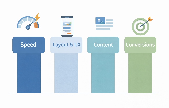
Throughout this guide, we’ll use these four pillars as your checklist.
How Google and Users Judge Mobile-Friendliness
Google has moved to mobile-first indexing, which means it primarily uses the mobile version of your site for indexing and ranking. It also looks at signals like Core Web Vitals (loading, interactivity, visual stability) to understand how users experience your pages.
Users, meanwhile, judge your site in seconds:
- Does it load quickly?
- Can they find what they need without pinching and zooming?
- Can they tap buttons and links without mis-clicking?
- Can they complete a task—like calling you, filling a form, or buying—without frustration?
If the answer is “no” to any of these, they leave. The rest of this guide is about turning those answers into “yes.”
Pillar 1 – Speed and Performance on Mobile
Why Mobile Speed Matters More Than Desktop
Mobile users are often on the move, using variable connections and older devices. A page that feels “fine” on a fast office connection can feel painfully slow on a 4G or congested network. Every extra second of load time increases the chance that a visitor will abandon your site.
Simple Ways to Check Your Mobile Speed
You don’t need to be technical to get a sense of your mobile performance:
- Use tools like PageSpeed Insights or Lighthouse to test key pages.
- Look at the mobile results specifically, not just desktop.
- Pay attention to metrics like “Largest Contentful Paint” (how quickly the main content appears) and “Time to Interactive.”
You can also do a simple real-world test: open your site on your phone using mobile data, not Wi‑Fi, and see how it feels.
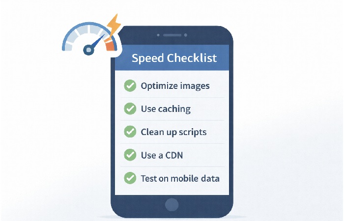
Practical Fixes You Can Ask For (Even If You’re Not a Developer)
You may not implement the fixes yourself, but you can ask your developer or agency for:
- Image optimization: compress large images and serve appropriately sized versions.
- Lazy loading: load images and videos only when they come into view.
- Caching and CDN: use caching plugins and content delivery networks to speed up repeat visits and global access.
- Script cleanup: remove unused plugins, tracking scripts, and heavy widgets that slow down mobile.
- Lightweight themes: avoid overly bloated themes with features you don’t use.
Mobile Speed Quick Wins Checklist
- Are your images compressed and not larger than they need to be?
- Are you using caching and, if relevant, a CDN?
- Have you removed unnecessary plugins and scripts?
- Do your key pages load in roughly 2–3 seconds on a typical 4G/5G connection for most users, or at least as close to that as your current setup allows?
Pillar 2 – Layout, Navigation, and Thumb-Friendly UX
Designing for Thumbs, Not Mice

On mobile, people use thumbs, not precise mouse pointers. That means:
- Buttons and links need to be large enough and spaced apart.
- Important actions should be easy to reach, often near the bottom of the screen.
- Avoid placing critical buttons too close together.
If you find yourself zooming in to tap something, it’s not thumb-friendly.
Navigation That Works on Small Screens
Good mobile navigation:
- Uses a clear, simple menu (often a hamburger icon) with the most important links at the top.
- Avoids deep nesting where users have to tap through many levels.
- May use a sticky header or footer with key actions (e.g., “Call,” “Book,” “Shop”).
Ask yourself: can a new visitor find your main services, products, or contact page in one or two taps?
Forms, Popups, and CTAs on Mobile
Forms and popups are common friction points:
- Keep forms as short as possible—only ask for what you truly need.
- Use mobile-friendly input types (e.g., numeric keyboard for phone numbers).
- Avoid popups that cover the entire screen or are hard to close on mobile.
- Make CTAs (buttons) clear, descriptive, and easy to tap.
Thumb-Friendly UX Checklist
- Are buttons and links large enough and well spaced?
- Can users reach key actions without awkward scrolling or zooming?
- Is your menu simple and easy to use on a small screen?
- Are forms short and mobile-friendly?
Pillar 3 – Content and Readability on Mobile
Writing and Formatting for Small Screens
Reading on a phone is different from reading on a laptop. To make content mobile-friendly:
- Use short paragraphs (2–4 lines).
- Break up text with headings, subheadings, and bullet points.
- Put the most important information near the top of the page.
- Avoid long, unbroken blocks of text.
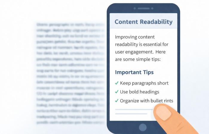
This makes it easier for users to scan and find what they care about.
Fonts, Contrast, and Accessibility Basics
Basic readability matters:
- Use a font size that is comfortable on small screens (often 16px or larger).
- Ensure sufficient contrast between text and background.
- Avoid light gray text on white backgrounds.
- Leave enough line spacing so text doesn’t feel cramped.
These changes help everyone, including users with visual impairments.
Media (Images, Video) That Don’t Break Mobile UX
Media should enhance, not break, the experience:
- Use responsive images that scale to the screen width.
- Avoid layouts that force horizontal scrolling.
- Make sure videos are playable on mobile and don’t auto-play with sound.
Pillar 4 – Conversions and Micro-Conversions on Mobile
What Counts as a Conversion on Mobile?
On mobile, conversions can be:
- A phone call or tap-to-call action.
- A form submission or quote request.
- A purchase or add-to-cart.
- A newsletter signup or chat/WhatsApp click.
For a deeper dive into when long-form content is worth the effort and how to make it defensible, see our guide on Zero‑Search Authority and long‑form content.

Making CTAs Obvious and Easy to Tap
To improve mobile conversions:
- Use clear, descriptive button text (e.g., “Get a Free Quote,” “Book a Call”).
- Place CTAs where users naturally pause—after key sections or benefits.
- Consider sticky call or chat buttons for service businesses.
Reducing Friction in Mobile Checkout or Lead Capture
Friction kills conversions. Reduce it by:
- Allowing guest checkout where possible.
- Minimizing the number of fields in forms.
- Supporting mobile-friendly payment options if you run an e‑commerce site.
Think of every extra tap or field as a potential drop-off point.
How to Audit Your Current Site for Mobile-Friendliness
Quick Self-Check on Your Own Phone
Start with a simple test:
- Open your site on your phone using mobile data.
- Try to complete your main conversion (call, form, purchase).
- Note where you feel frustrated or confused.
This gives you a user’s-eye view before you look at any tools.
Using Tools Without Getting Overwhelmed
Next, use tools to get more detail:
- Run key pages through PageSpeed Insights and look at mobile results.
- Check Google Search Console for mobile usability issues if your site is connected.
- Note recurring issues like slow loading, text too small, or clickable elements too close together.
You don’t need to understand every technical term; focus on patterns and major warnings, the same way you would when evaluating broader technology trends, like those discussed in our post on new technology trends to watch in 2023.
Prioritizing Issues by Impact
Not all issues are equal. Prioritize:
- Pages with the most mobile traffic (often your homepage, key service/product pages).
- Issues that directly affect conversions (forms, CTAs, checkout).
- Problems that appear across many pages (e.g., slow images, small text).
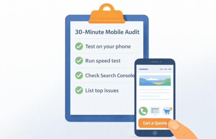
Mobile Audit in 30 Minutes
- Test your site on your phone and try key tasks.
- Run 2–3 important pages through PageSpeed Insights.
- Check Search Console for mobile usability issues.
- Make a short list of the top 5 issues to address.
Implementation Paths: DIY, Theme Tweaks, or Full Redesign
When Simple Tweaks Are Enough
If your site is already on a modern, responsive theme and your issues are minor (e.g., a few slow images, small text, or clunky forms), you may only need:
- Image optimization.
- Minor CSS tweaks for spacing and font sizes.
- Plugin cleanup and performance tuning.
These can often be handled by a freelancer or a small amount of developer time.
When You Need a Developer or Designer
You likely need professional help when:
- Navigation needs to be restructured.
- Forms and CTAs need redesign.
- Performance issues are tied to theme or custom code.
In these cases, a developer or UX designer can implement targeted improvements without rebuilding everything.
If you prefer to work with a specialist rather than handling theme tweaks yourself, partnering with an experienced WordPress development agency can help you implement mobile performance, UX, and layout improvements more efficiently.
When It’s Time for a Full Redesign
A full redesign may be necessary if:
- Your site is not responsive at all.
- It’s built on a legacy platform that’s hard to maintain.
- The design and content are outdated and confusing.
A custom build only pays off if your requirements are clear and you can sustain ongoing maintenance.
Your decision should consider budget, timeline, and how critical mobile performance is to your business.
Common Mistakes with “Mobile-Friendly” Websites
These are frequent pitfalls, not an exhaustive list.
Assuming Responsive = Mobile-Friendly
Installing a responsive theme is not the same as having a great mobile experience. If you ignore speed, UX, and conversions, you’ll still lose mobile visitors.
Designing Only on Desktop
Designing and reviewing only on large screens leads to layouts that break on phones. Always review designs and live pages on real mobile devices.
Overloading Mobile with Popups and Widgets
Too many popups, chat widgets, and banners can stack on top of each other and make your site unusable on small screens. Be selective and test on mobile.
Ignoring Accessibility and Older Devices
Heavy animations, tiny text, and low contrast can make your site unusable for some users and slow on older devices. Simple, accessible design is often better.
Step-by-Step Plan to Make Your Site Mobile-Friendly in 30–90 Days
A 30–90 day plan like this can work for many small to mid‑sized sites, but heavily customized or enterprise setups may need more time.
Week 1–2 – Audit and Prioritize
- Run your quick self-check and tool-based audit.
- Identify your top 5–10 issues.
- Decide which pages and problems to tackle first.
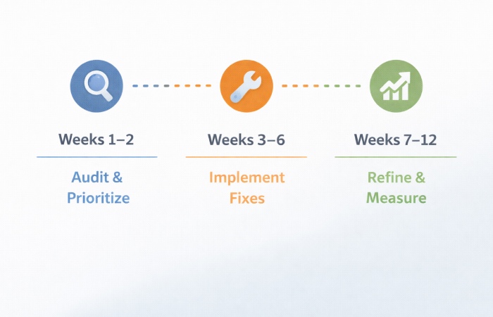
Week 3–6 – Implement High-Impact Fixes
- Optimize images and clean up scripts.
- Improve navigation and key forms.
- Adjust fonts, spacing, and CTAs for mobile.
Week 7–12 – Refine, Test, and Measure
- Monitor metrics like mobile bounce rate and conversion rate.
- Gather feedback from users and team members.
- Make further tweaks based on what you learn.
Treat this as a cycle, not a one-time project.
Measuring Success: How to Know If Your Mobile Experience Improved
Key Metrics to Watch
- Mobile bounce rate on key pages.
- Time on page and pages per session for mobile users.
- Mobile conversion rate for your main goals.
- Core Web Vitals for mobile.
Qualitative Feedback
- Ask customers how they find your site on their phones.
- Use session recordings or heatmaps if available.
- Pay attention to support tickets or complaints about the site.
When to Iterate Again
If metrics plateau or you notice new issues (e.g., after adding new features or content), repeat a lighter version of your audit and improvement cycle.
Conclusion – Make Mobile the Default, Not an Afterthought
Mobile-friendly websites are not a nice-to-have; they’re the default expectation. A site that loads fast, is easy to use with thumbs, and supports clear conversions will outperform a site that only “sort of works” on phones.
If you:
- Start with a simple audit,
- Focus on the four pillars—speed, layout, content, and conversions,
- Choose an implementation path that fits your resources,
you can turn your website into a mobile experience that serves both your visitors and your business. The next step is to pick one key page, run a quick audit, and implement one high-impact improvement this week.
FAQs on Mobile-Friendly Websites
1. What does “mobile-friendly website” actually mean?
A mobile-friendly website is one that loads quickly, is easy to navigate and read on a phone, and lets users complete key tasks without frustration. It goes beyond simply shrinking the desktop layout and focuses on speed, thumb-friendly design, and clear calls to action on small screens.
2. How do I know if my website is mobile-friendly?
You can start by opening your site on your own phone and trying to complete your main conversion, such as calling, filling a form, or buying. Then, use tools like Google’s PageSpeed Insights and Search Console to check for mobile usability issues and performance metrics. If your site feels slow, hard to navigate, or difficult to read on a phone, it’s not truly mobile-friendly yet.
3. Do I need a full redesign to make my site mobile-friendly?
Not always. If your site already uses a modern responsive theme and your issues are limited to speed, spacing, or forms, targeted tweaks may be enough. A full redesign is usually only necessary for non-responsive, very outdated, or structurally confusing sites.
4. How important is mobile speed for SEO and conversions?
Mobile speed is very important for both SEO and conversions. Slow pages frustrate users and increase bounce rates, and modern search engines use performance signals, including Core Web Vitals, as one part of their overall ranking systems. Faster mobile pages generally lead to better user engagement and higher conversion rates.
5. What are the most important mobile UX changes I can make quickly?
Some high-impact changes include optimizing images, simplifying navigation, enlarging buttons and tap targets, and shortening forms. You can also remove unnecessary popups and widgets that clutter the mobile view. These changes often improve both user experience and performance without a full rebuild.
6. How do mobile-friendly websites affect local businesses?
For local businesses, mobile-friendly websites are critical because many users search and act on the go. A site that loads quickly, shows clear contact information, and offers tap-to-call or easy directions can significantly increase calls and visits. A clunky mobile site, on the other hand, can drive potential customers to competitors.
7. Are there legal or accessibility considerations for mobile-friendly design?
Yes, accessibility is increasingly seen as both a best practice and, in many regions, a legal expectation for certain types of organizations. Ensuring readable text, sufficient contrast, and keyboard or screen-reader-friendly layouts helps users with disabilities and can reduce legal risk. The exact rules vary by country and industry, so it’s important to check the specific accessibility guidelines that apply to your situation, such as the Web Content Accessibility Guidelines, or consult an expert.
8. How long does it take to make a website mobile-friendly?
Timelines vary widely, but many simpler sites see noticeable improvements within a few weeks when you focus on speed, navigation, and key forms, while more complex builds or full redesigns can take several months, especially if you’re changing platforms or working through a larger agency process.
9. Can I make my site mobile-friendly without coding skills?
You can influence mobile-friendliness significantly without coding by choosing a good responsive theme, optimizing images, simplifying content, and configuring plugins or page builders. For deeper changes to layout, performance, or custom features, you may still need help from a developer or designer.
10. How should I prioritize mobile vs desktop improvements?
In many cases, mobile becomes the primary focus because, for a lot of sites, a large share of traffic and conversions now comes from phones. Start by checking your analytics to see your mobile vs desktop split and where conversions actually happen. If mobile traffic is significant or growing, prioritize mobile improvements first and ensure desktop changes don’t break the mobile experience.